EAT packaging
Case study
Project overview
Fresh ingredients. Front and centre.
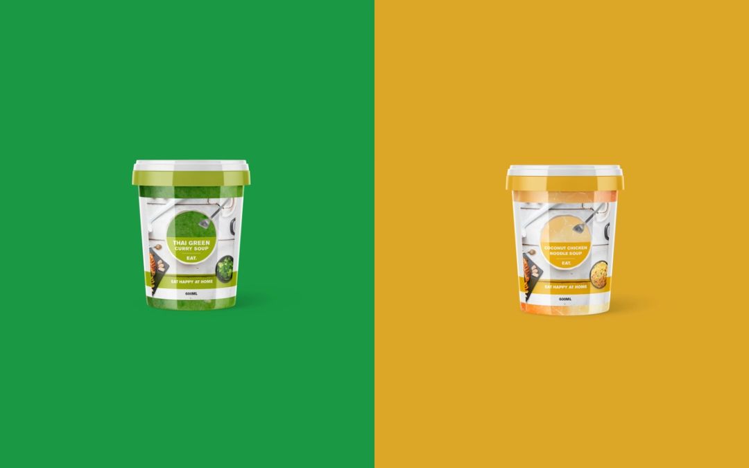
The EAT project explored packaging for a takeaway soup range, with the freshness and character of the food at the heart of the design. The aim was to create an appetising presence that made the contents the focus while retaining the simplicity and confidence of the EAT brand.
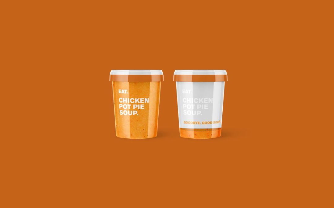
I explored how negative space and transparent areas could allow the soup itself to become part of the visual identity. Paired with bold, direct typography, this approach gave the product room to speak and kept the flavour name prominent.
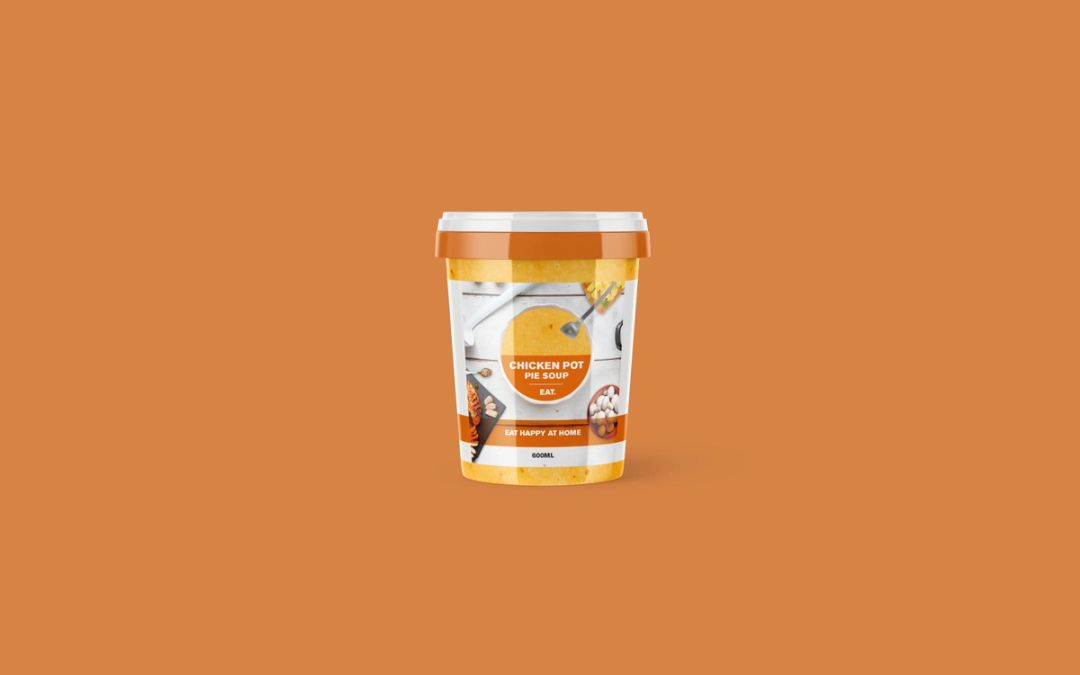
Alongside these stripped-back treatments, photographic routes placed the soup within a setting of ingredients and tableware. Colour helped distinguish flavours, while a consistent layout connected the designs as a range. The explorations considered different ways to balance product visibility, appetite appeal and brand recognition.
I was responsible for the packaging concept and visual design, developing alternative routes and applying them to pack mockups to assess how the ideas worked around the container.
- Client
- EAT
- Project
- Takeaway soup packaging
- Industry
- Food & Drink
- Credits
- Krow Group